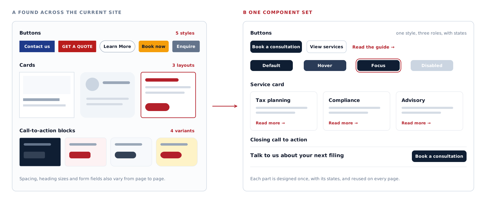
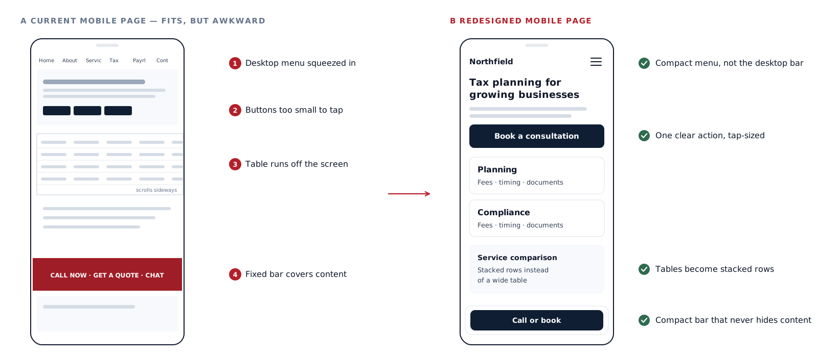
Sites that grew over time collect several button styles, different card designs, inconsistent spacing, duplicate form patterns and one-off call-to-action blocks.
A redesign consolidates these into a defined set of reusable components with consistent states, so pages look related and new pages can be built from parts that already exist. Larger sites get a fuller system; smaller ones need only what they use.
Visual refresh and brand
Typography, colour, spacing, imagery, icons and hierarchy are updated, with motion only where it helps. A visual refresh does not fix structural problems on its own, which is why it follows the audit. Where the brand identity has changed, the redesign applies it consistently; wider brand work belongs to graphic design.
Forms, enquiry paths and proof
Calls to action become consistent, competing actions are reduced, and forms ask only for what each enquiry needs, with clear labels, errors and confirmation. Genuine proof — projects, reviews, certifications, client names used with permission — moves next to the claims it supports. A redesign does not invent proof the business does not have.