Interactive design agency

SAM Web Studio · UI/UX Design Services

UI/UX Design for Applications, Portals and Digital Products

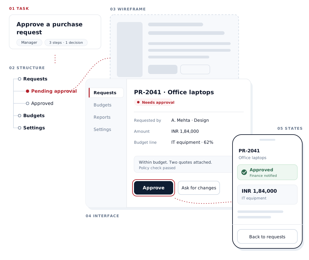
Interfaces designed around the tasks people need to complete. We design web apps, dashboards, portals, account areas and mobile app screens: the user flows, product navigation, forms and every state a screen can be in, handed to developers in a form they can build without guessing. We also audit and improve existing products without starting again.

Product Interfaces · Responsive Systems · Development Handoff

  • Information Architecture
  • User Flows
  • Interface Design
  • Responsive States
  • Design Handoff

Discuss Your ProductSee How We Design States

Boult Audio
Expert Bells
Printfolio
SAPTNOVA
T-series Stage Works
Genx
Surjen
Samava

When UI/UX design matters

Products usually need UI/UX work when the software works but people struggle to use it.

  • Users do not know what to do next.
  • Simple tasks take too many steps.
  • Navigation has grown untidy as features were added.
  • Forms ask for everything at once.
  • Primary and secondary actions look the same.
  • Errors say something went wrong without saying how to fix it.
  • Dashboards show everything and prioritise nothing.
  • Different roles see screens built for someone else.
  • Mobile layouts are desktop screens squeezed down.
  • Developers invent loading, empty and error screens because the designs never showed them.

UI and UX are different decisions

UX is about the task: what the user is trying to do, the steps involved, what information each step needs, where decisions happen, how people move between areas, and how they recover when something goes wrong. UI is how all of that appears on screen: layout, hierarchy, type, controls, their states, and consistency from screen to screen.

We design them together, because a well-styled screen with the wrong flow is still hard to use, and a sound flow with unclear screens still gets misread.

Start with the task

Every product screen exists to help someone do something. We start by listing those tasks — who does them, how often, what they need to know, and what happens next — before deciding on layouts.

This is also how older interfaces go wrong: screens that mirror the database, with every field in table order, rather than the order in which a person actually thinks about the job.

User flows

A user flow maps a task from its starting point to its outcome: the steps, the decisions along the way, alternative paths, and the routes back when something fails.

We map flows for the tasks that matter most — signing up, setting up an account or workspace, creating a record, uploading, booking, approving or rejecting, inviting a colleague, changing permissions, submitting and tracking a request. Flows show where steps can be removed, where users need information they do not have, and which screens the product actually requires.

Product navigation

Product navigation has a different job from website navigation. People return to the same product every day, so it needs to be predictable: users should be able to guess where an action or piece of information lives. We design global navigation between modules, local navigation within them, tabs, filters, search, settings and admin areas, and adjust what each role sees so people are not navigating around features they cannot use.

Role-based interfaces

Most business products serve several roles — administrators, managers, staff, customers, reviewers or partners, depending on the product. Permissions are enforced in development, but the interface has to make them understandable: what each role can see, which actions are available to them, and what they are told when something is restricted, instead of a button that silently does nothing.

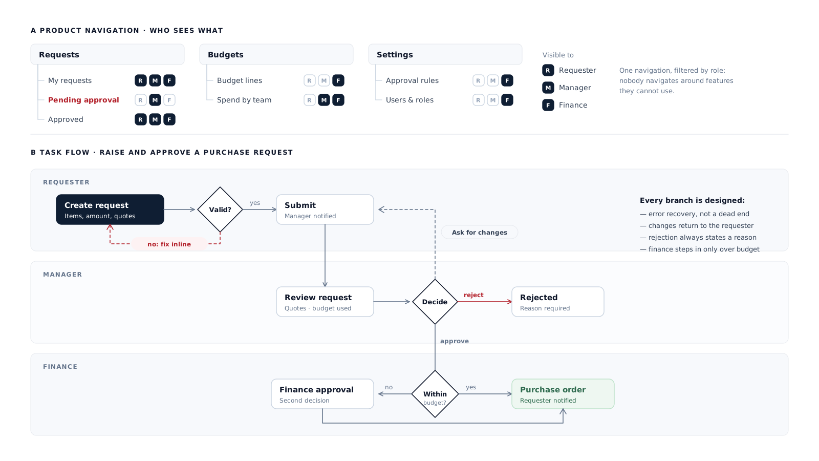
A purchase request moving between requester, manager and finance, with every branch designed. Scroll the diagram sideways to read it, or tap to open full size.Tap the diagram to open it full size, where you can pinch to zoom.

Wireframes

Wireframes are simplified layouts without visual styling. They are useful for new products, complex flows and aligning several stakeholders on structure before time goes into detail, because moving a block in a wireframe costs minutes.

On smaller or well-understood work we often go straight to designed screens. We use wireframes where they save effort, not as a fixed stage.

Prototypes

A prototype links screens together so a flow can be clicked through before it is built. It helps when interactions are complex, when stakeholders need to experience a sequence rather than read it, or when a transition or state is hard to understand from static screens. Not every project needs one; for straightforward screens, annotated designs are usually enough.

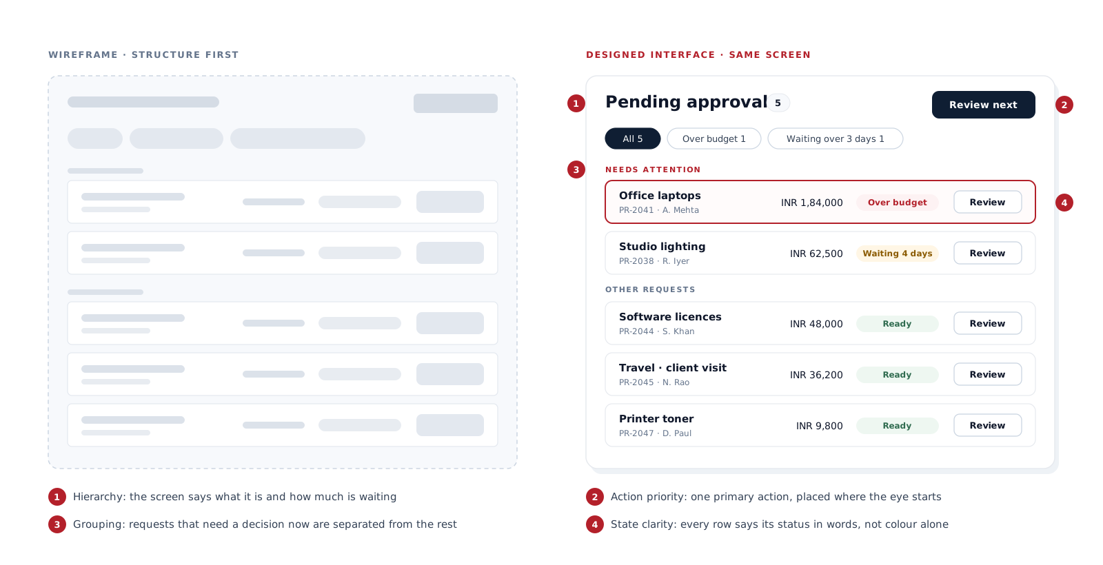
The same approvals screen as a wireframe and as a designed interface. Scroll the diagram sideways to read it, or tap to open full size.Tap the diagram to open it full size, where you can pinch to zoom.

Designing every interface state

Designs that show only the ideal screen leave developers to invent the rest. We design the states a screen can actually be in:

  • Default, hover, focus, active and disabled controls
  • Loading
  • Empty, such as a first visit with no data yet
  • No search results
  • Validation messages
  • Errors, with what to do next
  • Success and confirmation
  • Permission denied
  • Offline or lost connection, where the product needs it

This is where many products feel unfinished, and it is the part of UI/UX work that most directly reduces rework during development.

Forms and multi-step workflows

Forms are where much of a product's work happens. We group related fields, make required and optional fields clear, split long processes into steps where that genuinely helps, place validation messages beside the field, show saving and submitting states, confirm what happened, and set up inputs so phones show the right keyboard. For long workflows, drafts or autosave are designed in where the task needs them, so people do not lose work.

Dashboards

A dashboard should not display every available number. We design dashboards around what each role needs to notice and act on: what needs attention now, kept apart from general status; metrics shown with enough context to judge them; a small number of charts that answer real questions rather than a wall of widgets; and clear routes from any summary into the detail behind it.

Components and design systems

Product screens are built from repeating parts: buttons, fields, selects, tables, cards, modals, drawers, tabs, alerts, navigation, pagination, status badges, empty states and loaders, each with its states. For larger products we define these as a reusable component set with shared styles and usage notes, so new screens stay consistent and developers build each part once. A small application needs far less than a formal design system, and we scale it to the product.

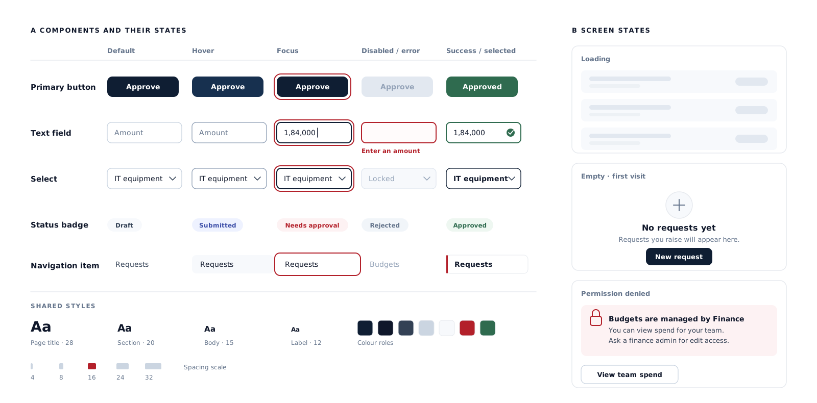
Components with their states, and the screen states designers usually leave out. Scroll the diagram sideways to read it, or tap to open full size.Tap the diagram to open it full size, where you can pinch to zoom.

Responsive product design

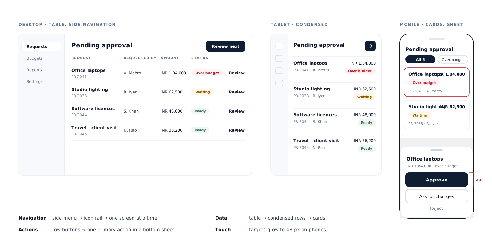
A complex desktop screen does not become a usable phone screen by stacking everything vertically. On smaller screens:

  • Navigation may move to a menu or tab bar
  • Tables may become lists or cards
  • Secondary detail may move behind a tap
  • The main action for that screen comes first
  • Touch targets get larger
  • Drawers or bottom sheets may replace side panels

Some products are desktop-first by nature; we decide with you which tasks must work fully on a phone. Mobile apps built on these designs are covered by our mobile app development team.

Accessibility

We design for keyboard navigation and a logical focus order, visible focus, sufficient contrast, labelled fields, clear input instructions, error messages that explain the fix, meaning that does not rely on colour alone, and motion that does not get in the way. Screen-reader behaviour depends on implementation, so accessibility continues through development and QA; a design on its own cannot make a product compliant.

One screen adapting across desktop, tablet and phone rather than shrinking. Scroll the diagram sideways to read it, or tap to open full size.Tap the diagram to open it full size, where you can pinch to zoom.

Where UI/UX fits in our work

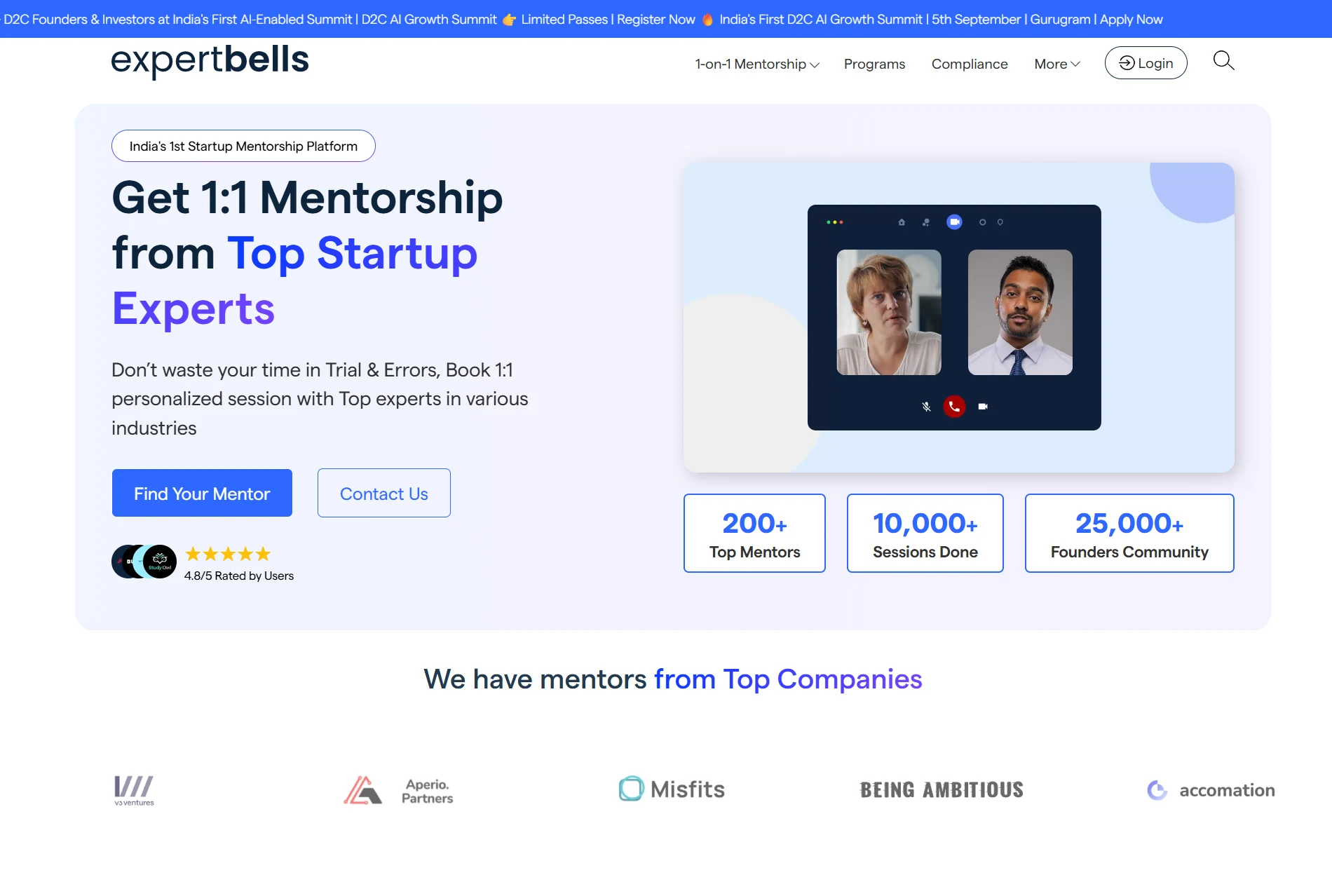
Expert Bells homepage with the mentorship hero, session statistics and partner logo strip

Live platform · homepage shown

Expert Bells

A mentorship and consultation platform connecting startup founders with experts over video calls. We designed and built its front end, including the session-booking flow and the calendar experts use to set their weekly availability — two sides of the same task, designed for two different roles.

SAM scope
Front end designed and built · Session-booking flow · Expert availability calendar · Founders and experts as separate roles

Read the Expert Bells case study

How a UI/UX project runs

  1. Discovery

    The product, its users, roles and constraints.

  2. Task list

    What each role needs to do.

  3. User flows

    For the key tasks.

  4. Product structure

    Modules and navigation.

  5. Wireframes

    Where structure needs agreeing first.

  6. Key screens

    The main workflows, designed in full.

  7. States

    Every state for those screens.

  8. Components

    The reusable parts.

  9. Responsive layouts

    For the tasks that need them.

  10. Prototype and review

    Walkthroughs of the flows.

  11. Handoff

    To our developers or yours.

  12. Design QA

    The build checked against the design, where scoped.

Not every project needs every step.

Handoff to development

Where we also build the product, design decisions carry into development directly and the same components are used in both. Where another team builds it, handoff is designed to reduce guessing: screen designs, flows, responsive layouts, component states, interaction notes, specifications and exported assets, with design QA against the build if it is in scope.

What you receive

Depending on scope:

  • User flows
  • A screen inventory
  • Wireframes where needed
  • Designed screens with all their states
  • Responsive layouts
  • A component set
  • Prototypes where needed
  • Interaction notes
  • Assets and a developer handoff
  • Design QA

For existing products, an audit with prioritised recommendations. A formal design system, prototypes and usability testing are scoped when the project needs them.

Existing products

Auditing an existing product

Many products reach us already live. An audit reviews the main workflows, builds an inventory of screens, and looks at navigation, inconsistencies between screens, repeated components that have drifted apart, states that were never designed, forms, differences between roles, mobile behaviour, accessibility issues, and where the built product no longer matches its design. Where support questions or feedback from existing users are available, they help decide which workflows need attention first.

Improving rather than redesigning

An audit rarely ends in a full redesign. More often it leads to targeted improvements on the workflows that cause most trouble, a clean-up of components, restructured navigation, or a redesign of one or two key areas. If we inherit existing design files, we review the screens, components, styles, naming, states, flow coverage and responsive layouts, then consolidate and extend what is there rather than starting again.

Reviews, walkthroughs and testing

Designs are checked through stakeholder reviews, task walkthroughs and prototype reviews with the people who know the work. Formal usability testing with recruited participants, and larger research programmes, are separate pieces of work that we scope explicitly when a project needs them; they are not assumed in every project.

UI/UX or website design?

The simplest test is what people are there to do.

UI/UX design

If the main job is to complete tasks inside a product — create, submit, approve, book, manage, track — that is UI/UX design.

Web apps · dashboards · portals · account areas · mobile app screens

Website design

If the main job is to read, compare and enquire, that is website design.

Public-facing websites

Many businesses need both: a marketing site that explains the product, and the product itself.

Design and the software behind it

UI/UX design decides how people interact with a system; development decides how that system works. For example, SaaS or custom software development defines the workspace model, permissions and billing logic; UI/UX designs how a user creates a workspace, invites a teammate, changes a role, upgrades a plan and understands an error. Designing both together avoids screens that promise something the system cannot do.

Related services

Design services

Building the product

UI/UX Design FAQs

UX design decides the task: its steps, the information needed at each, decisions, navigation and how people recover from errors. UI design decides how that appears on screen: layout, hierarchy, controls, states and visual consistency. They should be designed together.

Website design is for sites people read, compare and enquire through. UI/UX design is for products people complete tasks in — apps, dashboards, portals and account areas — where flows, states and roles matter more than page layout.

Yes. That work centres on user flows, product navigation, role-based views, forms, dashboards and complete interface states, designed so the development team can build them without filling gaps.

Yes. We design mobile flows, screen structure, touch interactions and states, deciding which tasks must work fully on a phone. The apps themselves can be built by our mobile development team or yours.

Where they help. Wireframes are useful for new products and complex flows; prototypes help when a sequence needs to be experienced before it is built. Straightforward screens often go directly to annotated designs.

Usually. An audit identifies the workflows, components and missing states causing most trouble, and the work that follows is often targeted — cleaning up components, restructuring navigation or redesigning key areas — rather than starting again.

Every project includes stakeholder reviews and task walkthroughs. Formal usability testing with recruited participants is scoped separately when a project needs it, so it is agreed up front rather than assumed.

The number of user roles and key workflows, the number of distinct screens, how many states and responsive layouts are needed, whether wireframes, prototypes or a component system are required, whether it is a new product or an existing one to audit, and review rounds. We scope each project and confirm the price and schedule in writing.

Start a project

Building a product, or fixing one people struggle with?

Send us your product idea, your existing screens or access to the live application. We will tell you where the design work should start, whether a targeted improvement would do, and what it would involve.

Discuss Your Product

We reply the same working day.

Let`s Chat, "We`re here.

|

Contact Info